 |
|
 |
 |
 |
 |
 |
 |
CIC_logo.jpg
Final version of the club logo. I friggin LOVE this image. I want it on everything I own. Photo by Alex "Zeke" Ibardaloza.
|
 |
| |
 |
|
|
 |
 |
CIC_text.jpg
|
 |
| |
 |
|
|
 |
 |
Logo_text.jpg
|
 |
| |
 |
|
|
 |
 |
CIC_AZ.jpg
My own logo. I have to fade out the CIC logo. There's just not enough contrast. Ther'es just no point to it if it can't be read. Photo by Alex "Zeke" Ibardaloza.
|
 |
| |
 |
|
|
 |
 |
flier_new_01.jpg
We print 4 of these on a page using a laser printer and cut them up and hand them out to the kickers that we meet. Probably my favorite design of all the fliers I've done. I know the flying clipper has been used to death but I thought it would be something hackers could relate to or at least comprehend. PS whirl looks much more dynamic but only if you already knew what it was. Photo by Alex "Zeke" Ibardaloza.
|
 |
| |
 |
|
|
 |
 |
flier_new_02.jpg
I have not yet printed any of these. I think I still need more work on the design. I do like how the whole figure is not shown, it's a little more interesting. Both the designs are busy with text and its a challenge to present all the info without making it look too boring or too hectic. Photo by Alex "Zeke" Ibardaloza.
|
 |
| |
 |
|
|
 |
 |
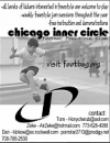
flier_old_01.jpg
This was the original flier. I found that when printed out the text was hard to read and the design was just not executed well. In the second version I tried to streamline the whole look and used a bolder typeface to make it easier to read. The varying type sizes makes it more interesting and helps emphasize the more important info. Photo by Alex "Zeke" Ibardaloza.
|
 |
| |
 |
|
|
 |
 |
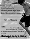
flier_old_02.jpg
I was thinking of redesigning this too. I like how the figure is big and cropped but its not in the way of everything. If anything I have to redo the type. I might keep it thin just so it will not compete with the figure for dominance. The backround will have to be lightened up too just for more contrast. Photo by Alex "Zeke" Ibardaloza.
|
 |
| |
 |
|
|
 |
 |
WP_abuse.jpg
This started out as an iron-on transfer I put on a shirt. I kept the design and modified it slightly to use on my desktop. That's an Abshire, in case you were wondering. Photo by Alex "Zeke" Ibardaloza.
|
 |
| |
 |
|
|
 |
 |
wp_play footbag_01.jpg
Simple. Bold. Red. Very typical of my work. I think it gets the point across extremely effectively. Originally created as wallpaper for my PC, this was used for the Midwest Regionals 2002 shirt. Along with the CIC logo, I want this on everything I own... waterbottles, towels, bookbag, hats, my friggin underwear... Photo by Alex "Zeke" Ibardaloza.
|
 |
| |
 |
|
|
 |
 |
play_footbag_light.jpg
Tile. I get bored with my wallpapers and change them just about every other week. . Photo by Alex "Zeke" Ibardaloza.
|
 |
| |
 |
|
|
 |
 |
1-play_footbag_darkblue.jpg
Another tile. This one is a little easier on my eyes. . Photo by Alex "Zeke" Ibardaloza.
|
 |
| |
 |
|
|
 |
 |
CIC_text_01.jpg
|
 |
| |
 |
|
|
 |
 |
CIC_text_02.jpg
|
 |
| |
 |
|
|
 |
 |
CIC_text_02-2.jpg
|
 |
| |
 |
|
|
 |
 |
CIC_text_03.jpg
|
 |
| |
 |
|
|
 |
 |
CIC_text_04.jpg
|
 |
| |
 |
|
|
 |
 |
CIC_text_05.jpg
|
 |
| |
 |
|
|
 |
 |
CIC_text_06.jpg
|
 |
| |
 |
|
|
 |
 |
CIC_text_06-2.jpg
|
 |
| |
 |
|
|
 |
 |
CIC_text_06-3.jpg
|
 |
| |
 |
|
|
 |
 |
1-002.jpg
|
 |
| |
 |
|
|
 |
 |
003.jpg
|
 |
| |
 |
|
|
 |
 |
1-005.jpg
|
 |
| |
 |
|
|
 |
 |
CIC 10.jpg
|
 |
| |
 |
|
|