 |
|
 |
 |
 |
 |
 |
 |
Hack_B&W_01.jpg
White pencil on black illustration board. An illustration for one of my design classes. We got a list of words and we had to present an image that could help define the word itself. This one was, concentration. It made sense at the time, but I dont think I could even begin to explain it to you now. . Photo by Alex "Zeke" Ibardaloza.
|
 |
| |
 |
|
|
 |
 |
Hack_B&W_02.jpg
The referance image. It was a black and white photo of me hacking near school during the fall in 1997. I was not expecting to kick and it was about 50 degrees so I didn't have my shorts with me. My friend had his camera and wanted to take some quick shots before our next class. . Photo by Alex "Zeke" Ibardaloza.
|
 |
| |
 |
|
|
 |
 |
Hack_B&W_03.jpg
My drawing is 1/1 scale to the referance. I used a grid to get it to size, I didn't trace. It's a fun challenge to draw in this style. Basically you are drawing in the highlights, not the shadows. . Photo by Alex "Zeke" Ibardaloza.
|
 |
| |
 |
|
|
 |
 |
Hack2_B&W.jpg
Black India ink on illustration board. An assignment on abstraction using an image from the same set of photos that I used for the previous illustration (Hack_B&W). Photo by Alex "Zeke" Ibardaloza.
|
 |
| |
 |
|
|
 |
 |
marker_mc_01.jpg
This was for some math project... plotting or graphing or something rather. This took me all of 10 minutes to make. Not one of my finest artistic moments, but it bumped my final grade from an B to an A. . Photo by Alex "Zeke" Ibardaloza.
|
 |
| |
 |
|
|
 |
 |
back_CIC.jpg
This is whats on the back of the t-shirts that I'm giving all the guys in the club for chistmas. The front will have their own charicature on it. I'll post more on this after New Years Jam, then after I catch up on my sleep... Photo by Alex "Zeke" Ibardaloza.
|
 |
| |
 |
|
|
 |
 |
tw_concept.jpg
This was the very fist sketch of this project. I used my extensive digital photo library for all my referances. This initial sketch took about 15 minutes to complete. Photo by Alex "Zeke" Ibardaloza.
|
 |
| |
 |
|
|
 |
 |
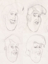
tw_heads.jpg
A compilation of head studies. Tims portrait was done using several images. I was trying to work out the desired facial expression and hairstyle.
. Photo by Alex "Zeke" Ibardaloza.
|
 |
| |
 |
|
|
 |
 |
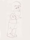
tw_body_final.jpg
Some of the drawings were done as one single form while others were done with the head seperate from the body. I didn't have a difinitive idea for all the characters poses and expressions so I worked on them as they came to me. Here the arms were modeled different from the concept sketch to show more expression and the body was turned in the other direction to help balance out the group composition. Photo by Alex "Zeke" Ibardaloza.
|
 |
| |
 |
|
|
 |
 |
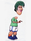
tw_body_head_final.jpg
My plan for making the shirts was to finish the drawings and have them colored and scanned. When they were entered into the PC I could do the layouts for the shirt front and group layout for the back then have them ready to print out. As I was working on the drawings I realized I was not going to have much time to do all the layout work after all the illustrations were colored in. I ended up scanning the uncolored sketeches as I finished them and worked on layouts when I didn't feel like drawing. . Photo by Alex "Zeke" Ibardaloza.
|
 |
| |
 |
|
|
 |
 |
tw_color.jpg
After I have the finished pencils I placed a sheet of marker paper over it and traced a copy of the charicature using a light colored water based marker. Then I colored the figure in with design marker and did the final outline with a fine tipped black marker. This whole process took about an hour. You might be able to see some mistakes and smudges on this image like where I added the red bracelet over the left wrist and the slight smearing on his cheek. Photo by Alex "Zeke" Ibardaloza.
|
 |
| |
 |
|
|
 |
 |
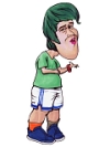
tw_final.jpg
After scanning the image I made final touch ups using Photoshop. The head was merged with the body, the smudges were cleaned up and the bracelet was fixed. This was easily my favorite of the group. Getting the look of his body was just as important as the likeness of his face. I thought it really captured Tims look and a bit of his personality. I did few all-nighters to get these ready for print but it was all worth it to see the guys reactions to their presents. . Photo by Alex "Zeke" Ibardaloza.
|
 |
| |
 |
|
|
 |
 |
WP_Brian.jpg
|
 |
| |
 |
|
|
 |
 |
WP_Dan.jpg
|
 |
| |
 |
|
|
 |
 |
WP_James.jpg
|
 |
| |
 |
|
|
 |
 |
WP_Jon.jpg
|
 |
| |
 |
|
|
 |
 |
WP_Kamil.jpg
|
 |
| |
 |
|
|
 |
 |
WP_Keaton.jpg
|
 |
| |
 |
|
|
 |
 |
WP_Meinard.jpg
|
 |
| |
 |
|
|
 |
 |
WP_Reile.jpg
|
 |
| |
 |
|
|
 |
 |
WP_Tim.jpg
|
 |
| |
 |
|
|
 |
 |
WP_Tom.jpg
|
 |
| |
 |
|
|
 |
 |
WP_Zeke.jpg
|
 |
| |
 |
|
|
 |
 |
CIC 2004.jpg
|
 |
| |
 |
|
|
 |
 |
CIC 2005.jpg
|
 |
| |
 |
|
|
 |
 |
CIC 2005 big.jpg
(0.25M)
|
 |
| |
 |
|
|
 |
 |
CIC 2005 bigger.jpg
(0.28M)
|
 |
| |
 |
|
|
 |
 |
sketch.jpg
|
 |
| |
 |
|
|
 |
 |
Flying Save
For backround story click here. . Photo by Alex "Zeke" Ibardaloza.
|
 |
| |
 |
|
|
 |
 |
Grrrrrr.jpg
|
 |
| |
 |
|
|
 |
 |
FR_01.jpg
This is Chad's character in Freestyle Reality. Sam wanted a Manga style art with Chris in a cool action pose. I scanned the pencil drawing and changed the levels in photoshop to darken the contour while simutaneously getting rid of the lighter sketch lines. Photo by Alex "Zeke" Ibardaloza.
|
 |
| |
 |
|
|
 |
 |
FR_02.jpg
Manga is not a style I'm terribly familar with so I had to borrow several referances to get a feel for it. One of the books gave me the idea to do several panels like a comic book instead of a single figure in the image. Color and layout were all done in Photoshop. Photo by Alex "Zeke" Ibardaloza.
|
 |
| |
 |
|
|
 |
 |
FR_03.jpg
Chris in Frestyle Reality. The multiple panels gave me a chance to use more poses for the characters that I came up with. Photo by Alex "Zeke" Ibardaloza.
|
 |
| |
 |
|
|
 |
 |
FR_04.jpg
I already commited to a black backround so I had to alter Chris' clothes slightly to avoid black on black. Photo by Alex "Zeke" Ibardaloza.
|
 |
| |
 |
|
|
 |
 |
FR_05.jpg
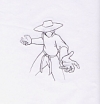
I kept the drawings simple and avoided being too line heavy. Photo by Alex "Zeke" Ibardaloza.
|
 |
| |
 |
|
|
 |
 |
FR_06.jpg
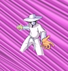
The shading on the characters would be kept simple as well using a darker tone for shadows. The actual costume used aluminum foil for the hat and bands, It would have driven me crazy to replicate that look so I went the simple smooth metalic route. I'm actually very happy with the look, it's subtle but I think it still gives depth and texture. The electricity was done by drawing thin white lines then outlined with green. Photo by Alex "Zeke" Ibardaloza.
|
 |
| |
 |
|
|
 |
 |
FR_07.jpg
If I were to use just one figure for the cover it would have been this one. I had no real good images to help me to get Chris' face so I just focused on getting the right proportions of his body which is short and stocky. That left hand was giving me all kinds of problems even after using a photo for help. Photo by Alex "Zeke" Ibardaloza.
|
 |
| |
 |
|
|
 |
 |
FR_08.jpg
I wanted the characters to contrast in size, proportions, and color. That also meant I had to come up with a different look for their energy effects. I didn't want to use black for the action lines so I used several colors instead. It really gives a sense of movement to the figures. Photo by Alex "Zeke" Ibardaloza.
|
 |
| |
 |
|
|
 |
 |
FR_09.jpg
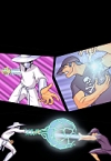
The final image with all the elements put together. I really like that there's a slight narrative to it. Someone gave the idea to make a footbag out of the electricity so I was able to incorporate that in the bottom panel when the 2 energy projectiles meet. Most people miss it initially. Photo by Alex "Zeke" Ibardaloza.
|
 |
| |
 |
|
|
 |
 |
4S_colored.jpg
|
 |
| |
 |
|
|
 |
 |
bodybag_03.jpg
|
 |
| |
 |
|
|
 |
 |
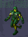
Iron Fred
|
 |
| |
 |
|
|
 |
 |
Iron Fred: The Freducator
(0.45M)
|
 |
| |
 |
|
|
 |
 |
WP_Freddy.jpg
|
 |
| |
 |
|
|