 |
|
 |
 |
 |
 |
 |
 |
USO_ref.jpg
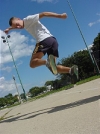
For the US Open Freestyle Championships shirt Scott Davidson said he wanted a drawing of a shredder with footbag freestyle somewhere in front. This is the photo referance. I would have put this in My Favorites section if it were not already here. Cool move. Dynamic motion. Different angle. Keaton (CIC's newest member) is shredding hard and having a fun time doing it. I think this image just has a lot of energy to it and that's why I wanted to use it for this shirt design. . Photo by Alex "Zeke" Ibardaloza.
|
 |
| |
 |
|
|
 |
 |
USO_art_01.jpg
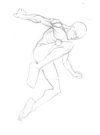
The figure was roughly 5x8 inches. I opened the referance in photoshop (I have a digital camera and all my photos are on my pc) and put a grid over it. I then made a grid on a piece of 11x14 inch bristol board and started the drawing. I decided to make the footbag a seperate piece so that I could have a little more flexibility on the final design if I needed it. Black india ink was applied over the rough pencils using several sized paintbrushes. I opted for the brushes over a technical pen so I could get a wider, more fliud line. This image was not scanned, its a photo from my Sony Mavica. You can see some of the light reflecting off some of the ink. That had to be cleaned up before I started the final design. Photo by Alex "Zeke" Ibardaloza.
|
 |
| |
 |
|
|
 |
 |
USO_art_02.jpg
All that energy the photo had was lost in the transition to an illustration. I think I made it too level, too stable. I'd like to say that I had purposely made the face a bit vague so that it could be everydayjoe shredder. Actually I had messed up trying to get Keatons likeness. The addition of the text is nothing special. I just did not want anything centered. At this point I might have been running behind shedule and could not come with anything more clever. Overall I think it's a solid piece, nothing too spectacular. . Photo by Alex "Zeke" Ibardaloza.
|
 |
| |
 |
|
|
 |
 |
USO_art_03.jpg
This was just to show how I wanted the design on the shirt. I placed the final image over a pic of my brother in a plain white shirt. I like simple, bold designs. I try not to add any additional elements that I don't need for the sake of something flashy. Less is more. And faster. And cheaper. Photo by Alex "Zeke" Ibardaloza.
|
 |
| |
 |
|
|
 |
 |
chctr_shrt.jpg
A view of all the shirts before I gave them out to they guys. Everyone in the club got a shirt with their charicature (that I drew) on it. Photo by Alex "Zeke" Ibardaloza.
|
 |
| |
 |
|
|
 |
 |
NYJ_concept_01.jpg
One of the earlier sketches for this project, wacom tablet in photoshop. I did a bunch of quick pencil thumbnails along with these to try and find a pose and angle I really liked. Photo by Alex "Zeke" Ibardaloza.
|
 |
| |
 |
|
|
 |
 |
NYJ_concept_02.jpg
Basically the same pose but a bit more refined. At this point I've pretty much settled on how the body is positioned, I just needed to show it at a more interesting angle. Photo by Alex "Zeke" Ibardaloza.
|
 |
| |
 |
|
|
 |
 |
NYJ_concept_03.jpg
Worm's eye view. Probably not a very common point of view in footbag but definatley more dynamic and has the potential to make a really cool shirt.But I was afraid I'd have a little trouble finding refrences to help me out so I decided not to go with this one. Photo by Alex "Zeke" Ibardaloza.
|
 |
| |
 |
|
|
 |
 |
NYJ_concept_04.jpg
It was suggested that I tip the body forward. This was one of many, many attempts to try and do so. As I tipped the upper body towards the viewer I ended up moving the knees closer to the chest. I really don't notice much of a change in angle on this one, its just rotated slightly to the left. Photo by Alex "Zeke" Ibardaloza.
|
 |
| |
 |
|
|
 |
 |
NYJ_concept_05.jpg
I'm really frustrated at this point and crunched for time. Here I'm going back to basic shapes to construct the body in the right perpective. Half way through it, I gave up and bust out a posable action figure and my digital camera. Photo by Alex "Zeke" Ibardaloza.
|
 |
| |
 |
|
|
 |
 |
NYJ_scanned.jpg
After a quick sketch of the photo reference I started adding in the anatomy and clothes. The folds in the shirt and shorts proved quite difficult to make them look like they're actually wrapped around a human body.This drawing did not need to be done too 'tight' since I would have been doing the rest of it on the computer. I just need enough info for the lighting. Photo by Alex "Zeke" Ibardaloza.
|
 |
| |
 |
|
|
 |
 |
NYJ_Preview.jpg
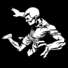
Near it's completion and Im very pleased with how its turning out.There are little to no curves on this image and it had a nice slick look to it already. I knew it was going to be troublesome to justify the smaller legs once I flattened the image and made it more abstract. But I'll stick with it unless I get enough people that mention it. This particular style is based on the work of 2 comic artists - Frank Miller (Sin City) and Brian Stelfreeze. Photo by Alex "Zeke" Ibardaloza.
|
 |
| |
 |
|
|
 |
 |
NYJ_Final.jpg
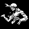
Finally. I made some changes to the face and hair from the previous image and added a sandbag.I ended up outlining the left hand to keep it from blending in with the shorts and to give it more 'pop'. Photo by Alex "Zeke" Ibardaloza.
|
 |
| |
 |
|
|
 |
 |
Preview
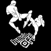
This is still a work in progress. I'll be adding a footbag and tweaking the outlines of the character on the left and possibly some simple shading. Feel free to e-mail me or PM me on modified.in with questions and comments. Photo by Alex "Zeke" Ibardaloza.
|
 |
| |
 |
|
|
 |
 |
4S_Shaded.jpg
|
 |
| |
 |
|
|
 |
 |
example_1_color.jpg
|
 |
| |
 |
|
|
 |
 |
Revised final version
|
 |
| |
 |
|
|
 |
 |
example_2_color.jpg
|
 |
| |
 |
|
|
 |
 |
WCC_Spike.jpg
|
 |
| |
 |
|
|
 |
 |
DSC_0123.JPG
|
 |
| |
 |
|
|